WEBSITE REDESIGN PROCESS
1. ASSESSMENT
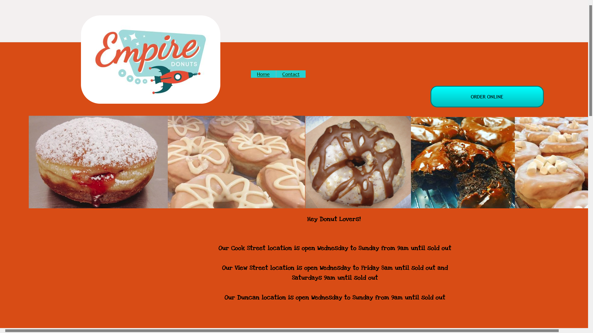
At first glance, the brand has a fun colour palette and mid-century theme. It will be important to carry this into the updated design. After recieving user feedback, I found that while the layout was effective for navigation, the misaligned elements made customers reluctant to share payment information. Users also commented that the orange made the website difficult to read. Armed with this knowledge, I did some sketches and made my first prototype.
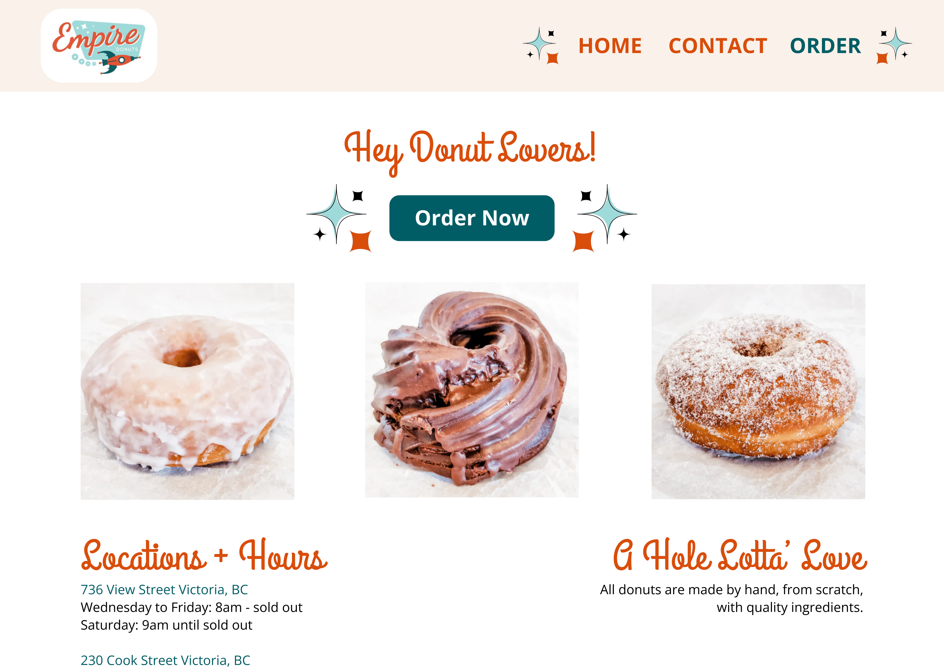
2. FIRST PROTOTYPE
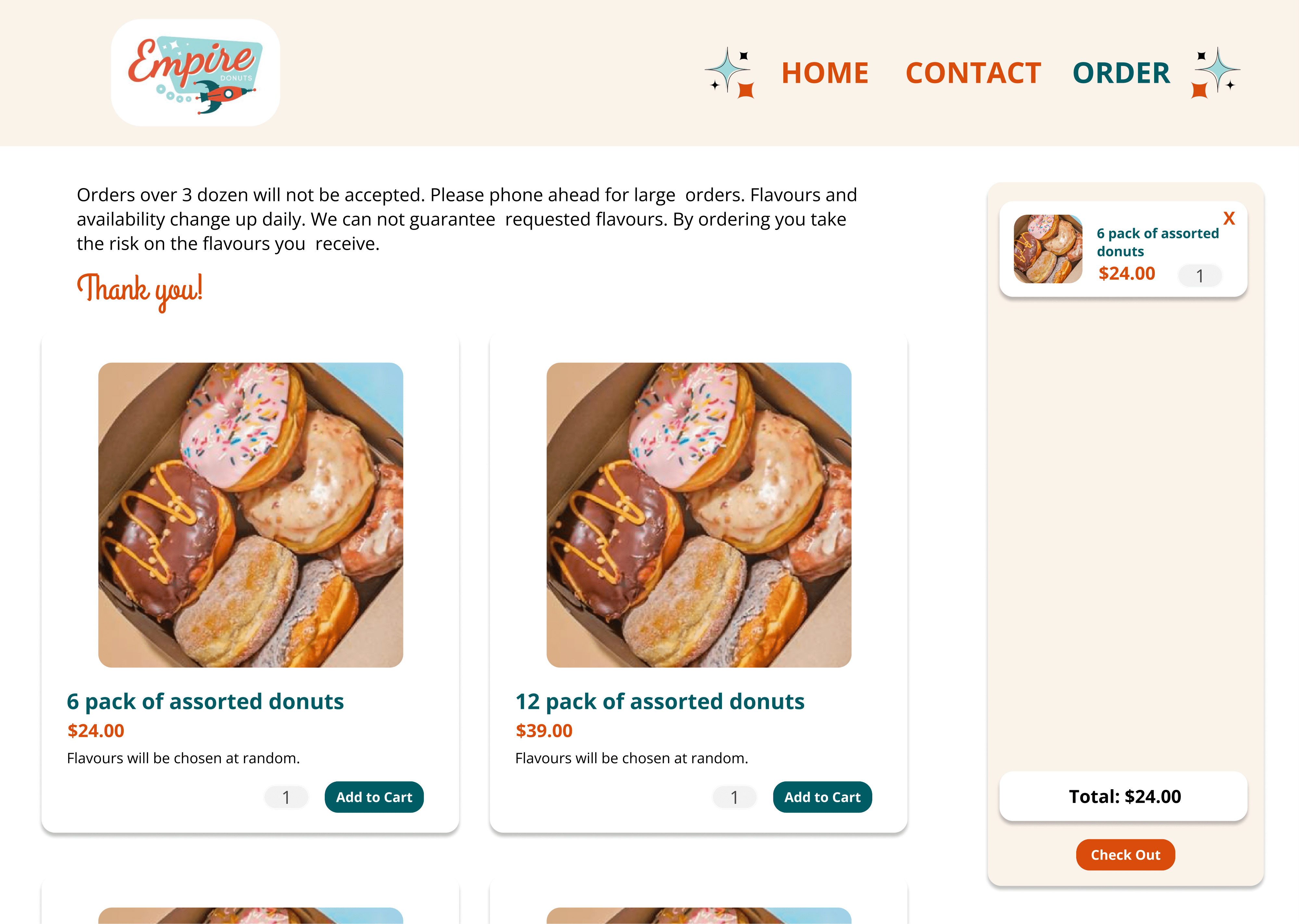
This iteration was, perhaps, an over correction. While doing user testing, one participant called this design "millenial beige" which was NOT in line with the fun 1950s aesthetic I was going for. However, users agreed that the website was more usable and the information easier to read. I achieved this by utilizing the Usability Heuristics principles of Consistency, Recognition, and Minimalist Design. By creating a more familiar layout with more minimal use of colour, users were more comfortable navigating the site and felt more confident in its legitimacy. Still, I took the feedback I recieved and went on to the next iterations.
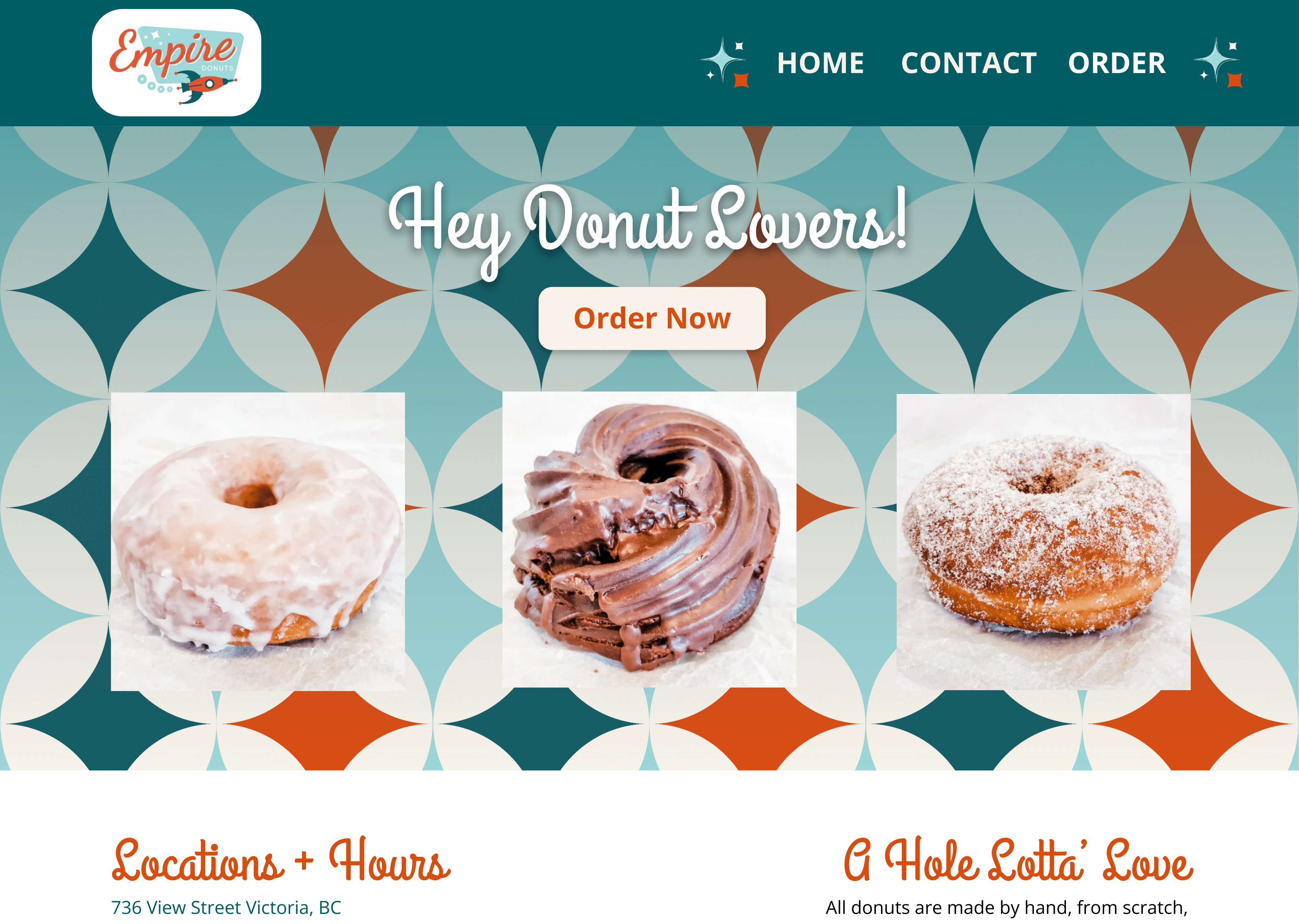
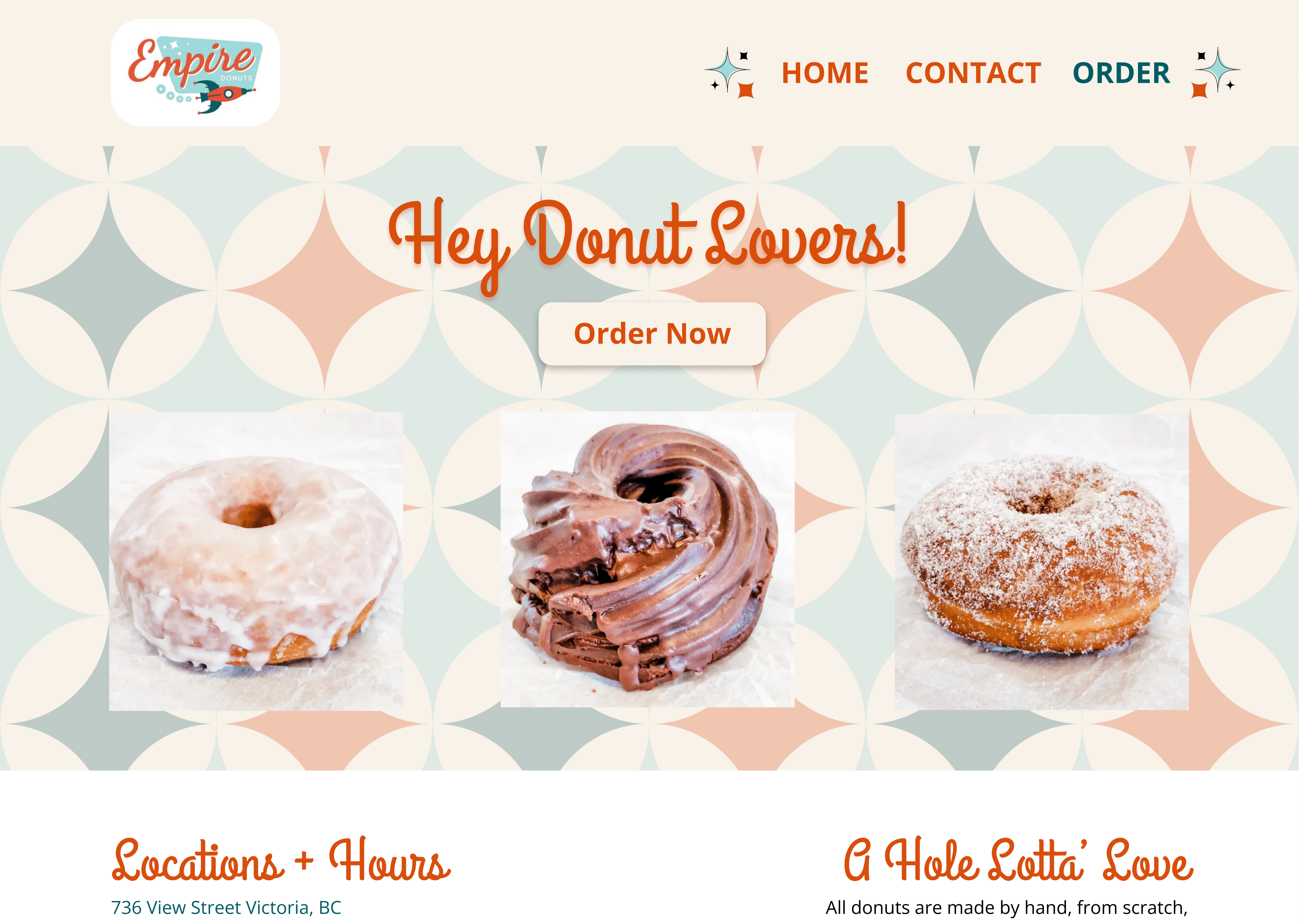
3. SECOND PROTOTYPES
For this round of user testing, I created two separate versions with different uses of colour in response to previous feedback. I wanted to see if users truly wanted to see more colour. I also created a 1950s inspired repeating pattern to use as a background image to add some interest, even to the more beige prototype. Users had very strong opinions about these designs, voicing their dislike for the more beige design again. I also recieved feedback about how it was unclear what page the user was currently on, and that they did not like the way the donut images looked ontop of the pattern. Time for another iteration.
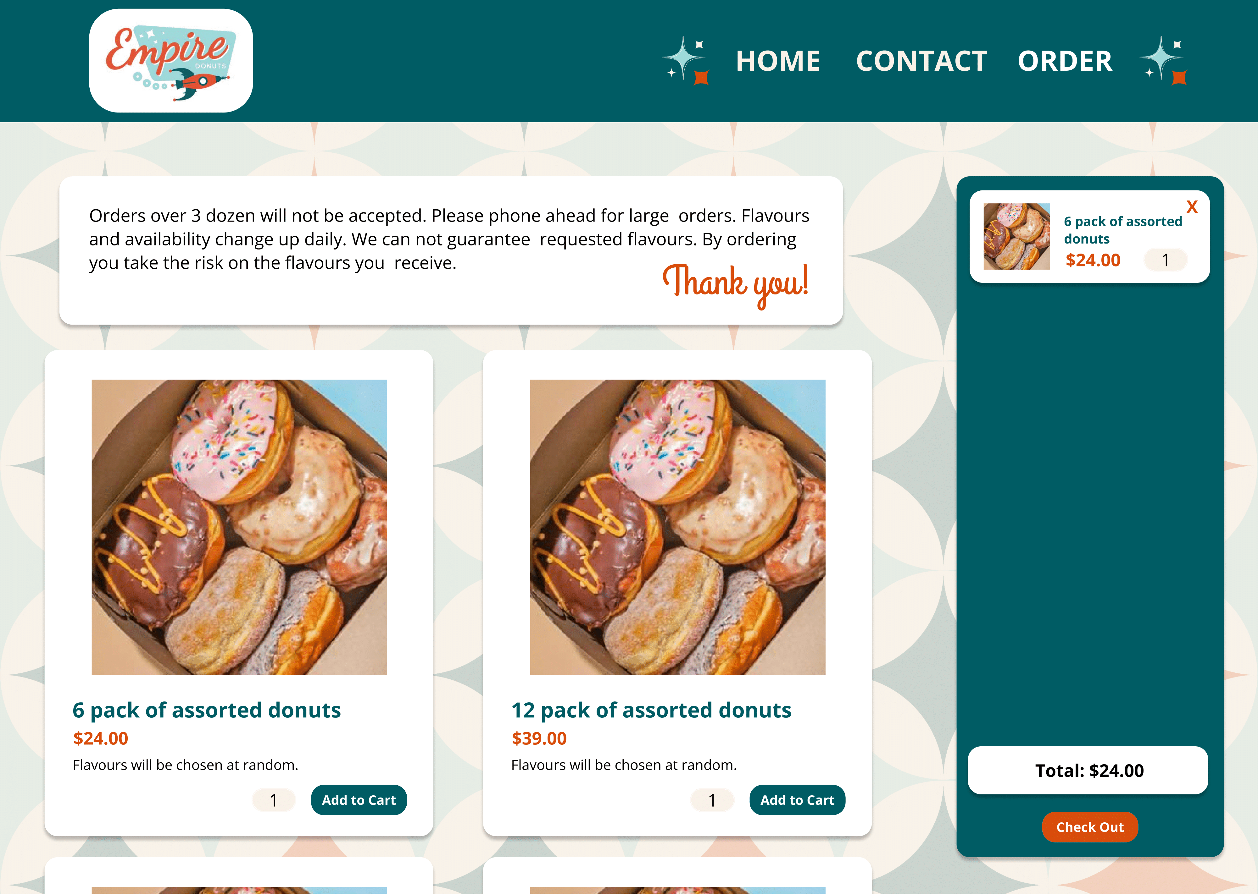
4. FINAL DESIGN
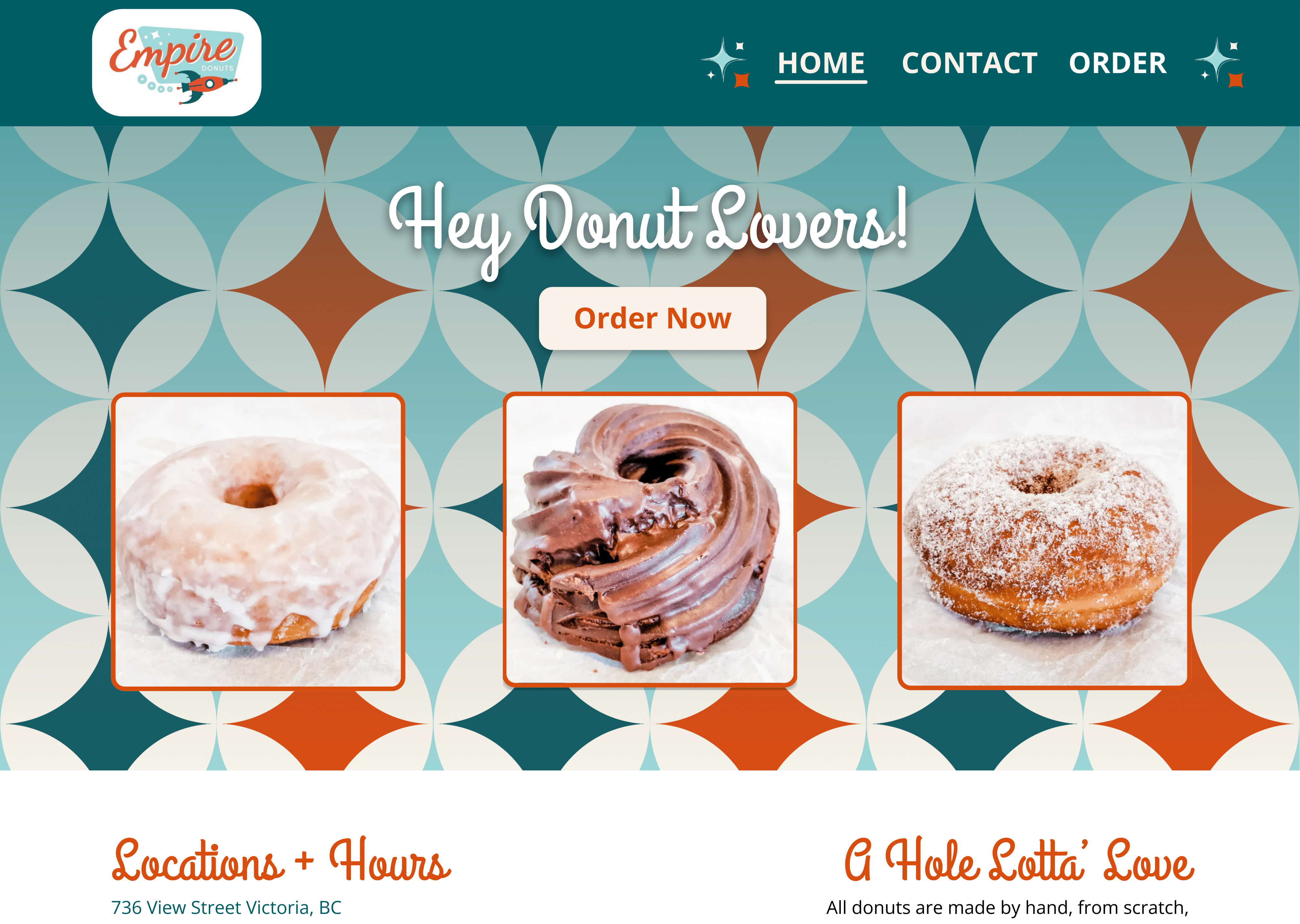
Based on the feedback I recieved from users in previous iterations, and some advice from my instructor, I settled on this finalized version for the website redesign. With final user testing, users liked this version and felt comfortable and confident using it to order donuts. The orange borders added around the images, and slightly rounded corners helped to make them pop off of the patterned background. I feel that this final iteration meets my goal of keeping the design in line with the brand's colourful design sensibilities and fun product while elevating it in order to properly represent their high quality and delicious products.
